Animal Photography
Lisa Abel
Enjoy my view through the lens.


London Zoo
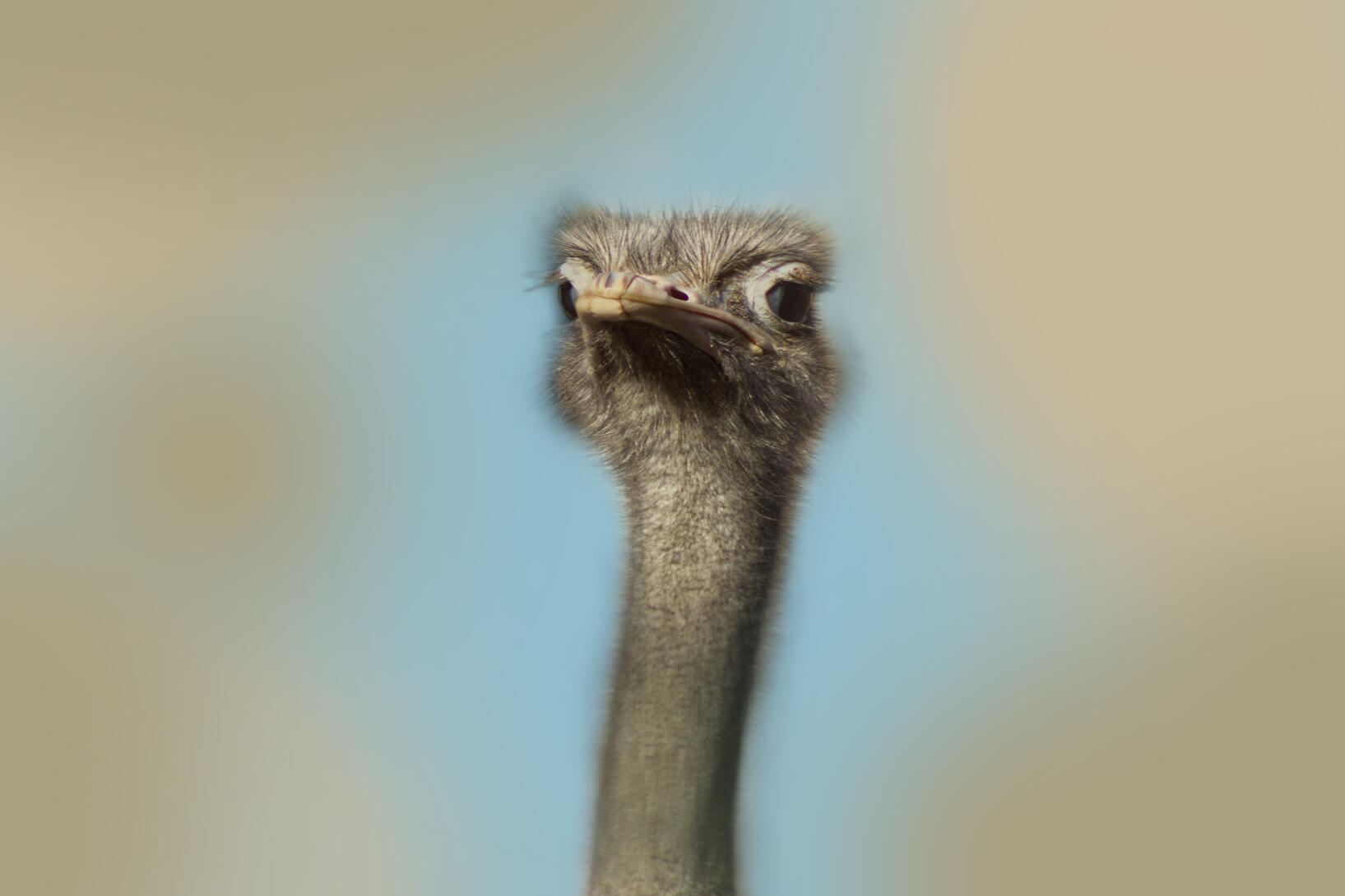
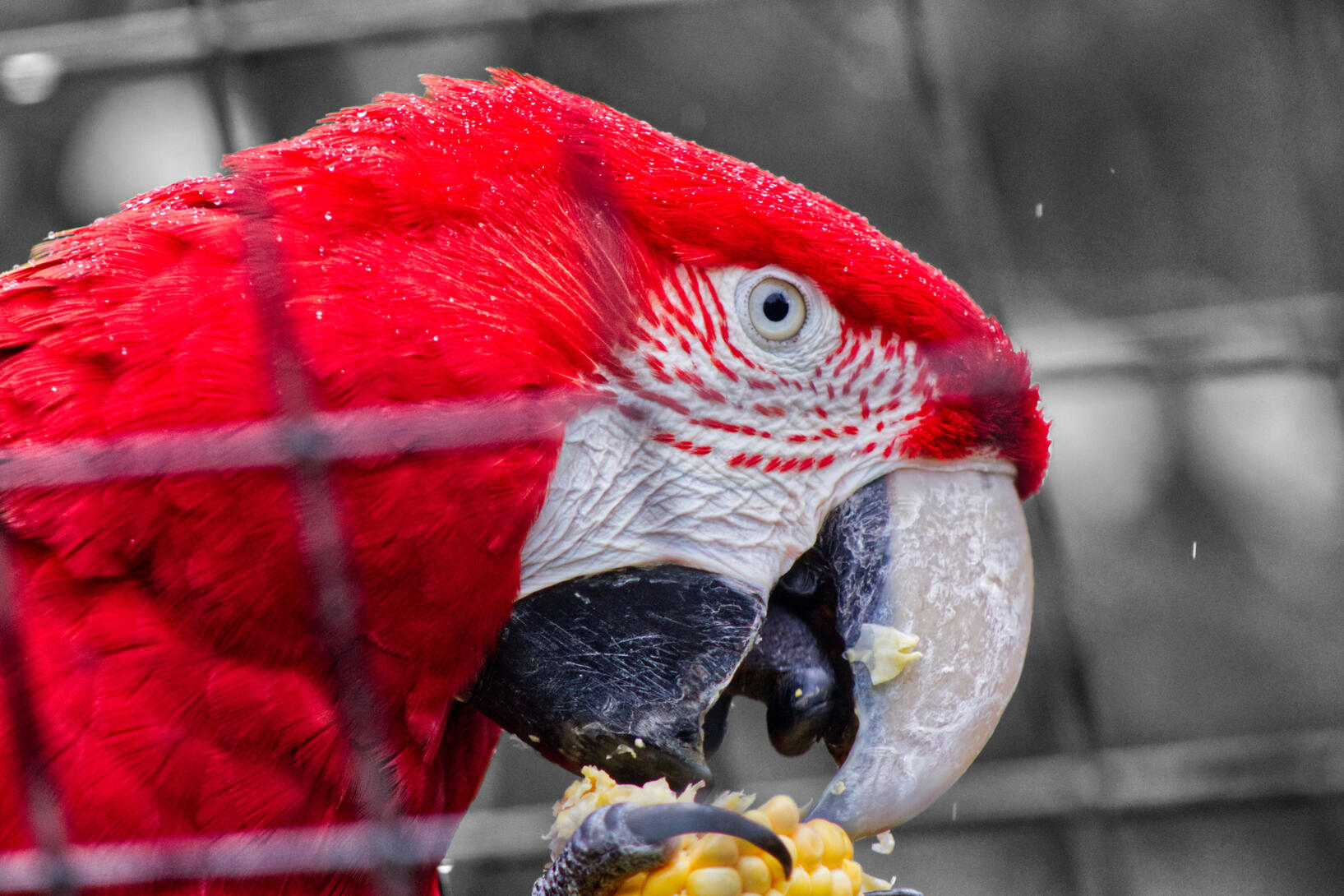
I went to London Zoo on 4th November 2023 as my first location from changing paths for my project. This location was chosen because it was an easy place to access. This was a great opportunity as it gave me an insight into how I wanted to continue my commercial animal project. I wanted to use this opportunity to get to know my camera and how to capture the images I wanted with subjects I haven't worked with before.It was raining at the start of the day until before midday, it started to become sunny in some parts which uplifted the setting. This continued until towards the end of the day where clouds were brought out.I didn't want to make myself feel pressured by making sure I have captured the ‘final’ images for the commercial product during this visit, so I had ideas of attending another location as a back up and after reflecting on the images that I had taken on this visit.Before attending the location, I researched into the photography conditions through their website to see if I could use the images I took. There was nothing to suggest that this was not allowed, as well as this being for educational purposes.
I had a rough idea that was to create commercial products that would be seen in a zoo gift shop, whilst thinking about my target audience who may like the animal shots taken. However, I am not limited to this decision but it was a good starting point. As I develop the images these ideas will become more apparent.Here are some handpicked RAW photos and all contact sheets.
RAW Photos


After taking the photos I decided how I would like them to be edited and chose the best ones to be used as the commercial product. View here!
Contact sheets
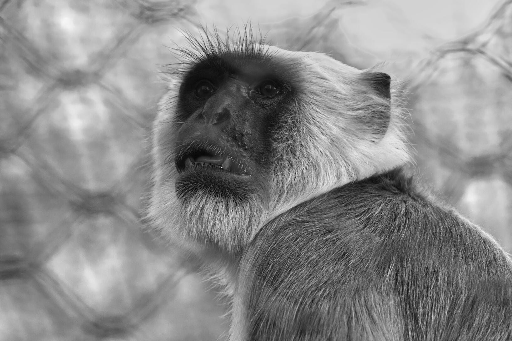
These are contact sheets from my London Zoo visit. After seeing them and printing them out it was good to see them all collectively in a smaller form. I accidentally printed them in black and white which turned out to be a good thing to see them in black and white as I hadn’t thought about changing them to this way.


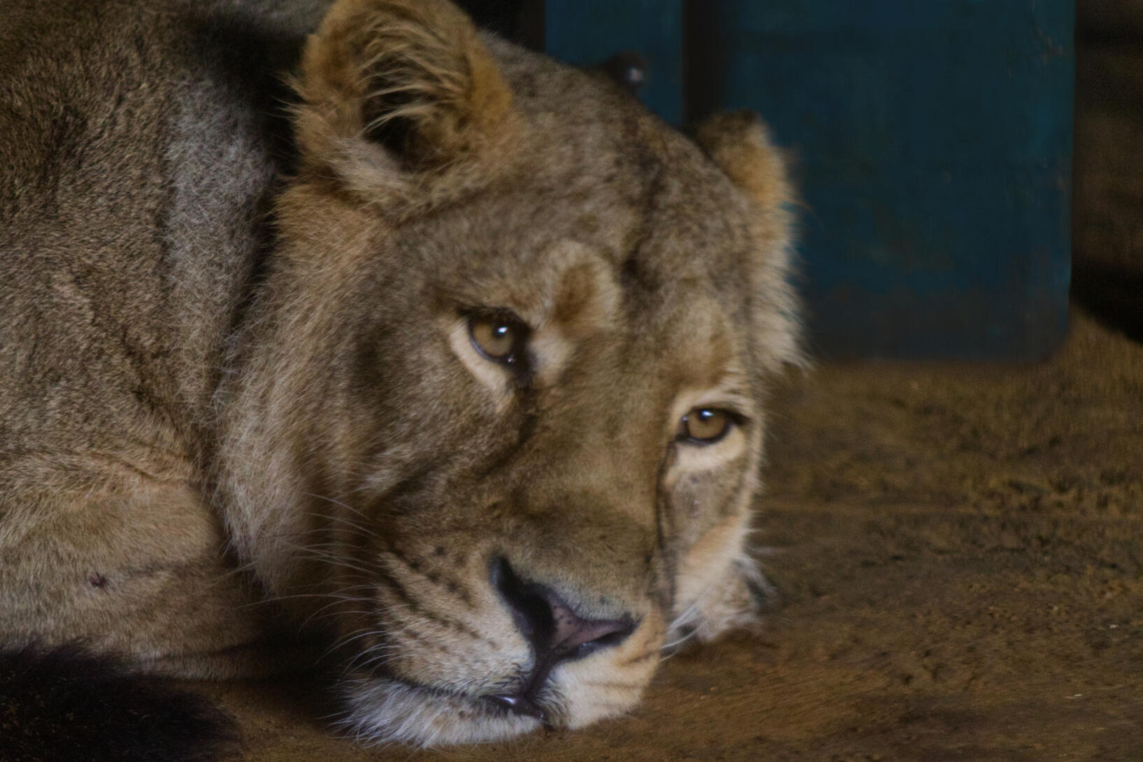
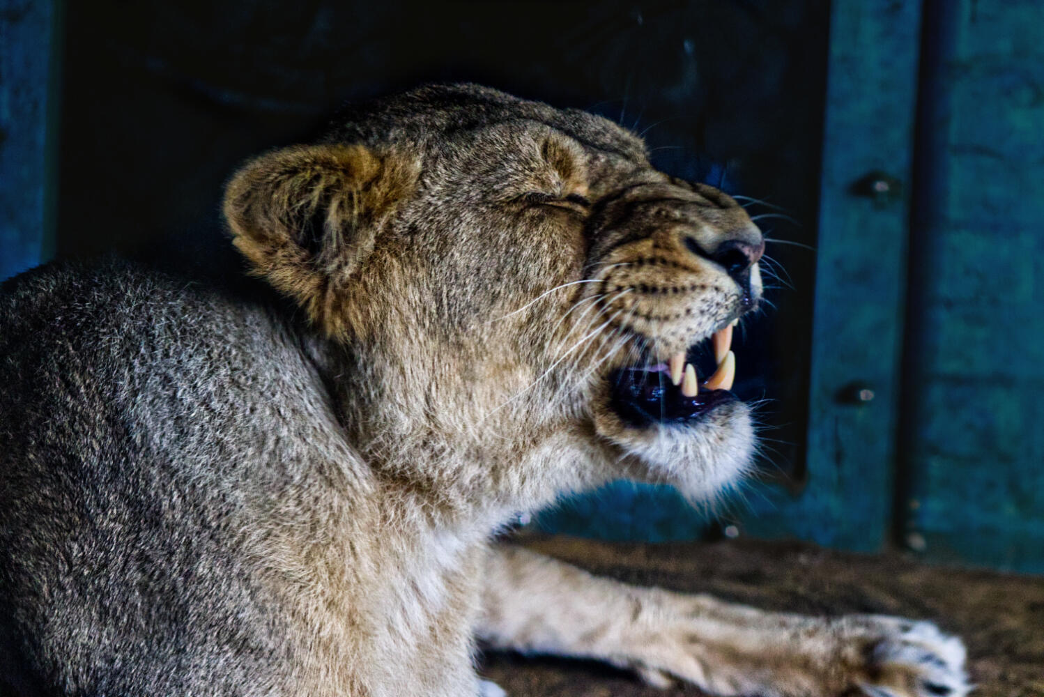
Overall, I think that London Zoo was a good place to start my path into animal photography. The strong subjects helped me to encourage my images to make them the best they can be. I would definitely go again to capture more of the stunning animals they have, and would have gone again if I had more time. Before attending the location I looked ahead of the weather, despite knowing that It was going to rain for a bit of the day I had train tickets booked ahead of time. If the location was closer I would have planned when to go with nicer weather. Nevertheless, the sun came out around noon for the majority of the afternoon which was good. My camera did get wet at the start of the day, with this in mind I brought a makeshift cover just in case I needed it - I did!Limitations for this shooting consisted of the unpredictable weather, but I was determined to capture my shots in any condition. Also the way in which the animals behaved such as where they stayed. If they were under shelter such as the lions I found that the shots didn't come out too well resulting in some of these shots not being chosen. Being inside also means that there is going to be lighting issues shining on the glass, I found that some reflections were hard to hide in the viewfinder.
Despite thinking ahead of what I needed and what I should do when I was there before attending the shoot, I didn’t realise how important it was to look back at what I took to check that It is what I wanted. I have come across this in previous shoots and left disappointed that I didn't capture what I thought. As this was a location that I knew was my only shot at getting good images, I did briefly look back at images throughout the day, but clearly not enough as I was somewhat disappointed after I looked back at what I had taken because the shots were not clear enough. I should not rely on what I see in the viewfinder to be what is captured, so next time I will be more careful and pick my shots more wisely and take my time to take and look afterwards. However, the viewfinder and camera screen are rather small also meaning that I couldn’t necessarily see if the image was blurry or not.
I knew that a tripod would be useful for this visit to get clear shots which let me down this time. I didn't bring this due to having extra bags to carry and ensuring that I attend each animal. If there was more time throughout the day to spend a lot of time with each animal I would have got better shots to use. If i was to go again I would definitely consider bringing this next time as I would have already gone to each animal previously.Moving on, despite being let down by the images being different to what I thought, I did get a handful of good shots that can be used for the final products. With having a strong idea of attending another location, I wanted to also use this as practice so that there wasn’t so much pressure to get the perfect shots this time. I did some preparation before attending such as checking If photography is allowed in this location, and prepping for weather troubles which I handled successfully. I wanted to ensure that I looked back at what I took throughout the visit which I did do, but not carefully. I spend the duration from opening to closing to make the most of the day and planned to walk around everywhere including attending talks.From this visit, It has taught me a lot about my camera and the types of shots I wanted to take with gift shop products in mind. It has prepared me for if I attend another location so that I ensure to get the best shots. I will definitely go again in the future to further advance my skills.
Primary Research - Gift Shop
As stated previously I have a broad idea of what I want the final commercial product to be for the project. Since deciding to go to zoos I feel that the best audience for this would be individuals and families that attend gift shops after their visit. This leaves the option of products to be wide range to choose from such as notebooks and pens to key rings and magnets.
I wanted to make the most of my visit to London zoo by viewing the gift shop to get inspiration of the type of product they sell. This helped me to have an idea of the type of shots to get. I didn’t want this to be what I was restricted to, but it helped to give me an idea. I took some images to refer back to.
This was a good way to see the products in person, and some products I wouldn’t have thought about. I like to see how others have represented their images which reflects the quality of the product.


Hamerton Zoo
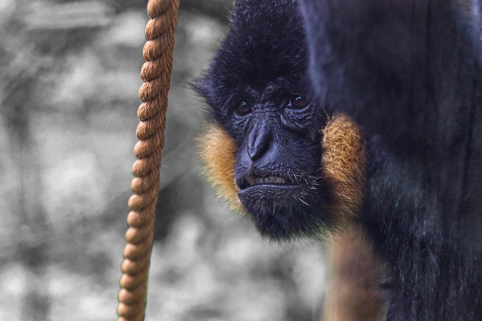
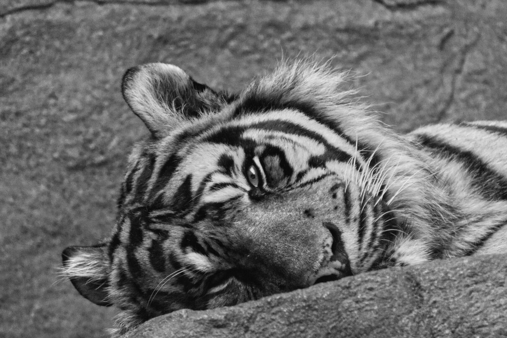
I went to Hamerton Zoo on 26th November 2023 as another course to gather images for my project. Since changing paths, I have had a keen interest in animals. Partially why I chose this zoo is because I desperately wanted to see a white tiger, also because it was another easy location to access. I didnt want to go to the same place as before or see all the same animals, I wanted something a bit different and I knew I wanted to get amazing shots in my style of the white tiger that I can use for product ideas.The weather overall was a dull day which greatly impacted the images taken. Towards the end of the day there was light spitting. This weather not only impacted the way the images were taken but also determines how the animals would be presented which then had further impact on the shots taken. On the other hand, it meant that there were less people leading to less risk of unethical practice.
If there was more time I wouldn’t hesitate to go back to ensure that my images were the best they can be.As this zoo was smaller it meant that it could be walked around multiple times. I went round again after viewing what shots I had taken and took images of animals that didn't turn out how I wanted or of animals that were hiding the first time. I am happy that I did this as I managed to capture animals different behaviour at different times of day.After going to London and thinking about what commercial products I wanted, It helped me to know what type of shots I wanted such as for a portrait or landscape notebook. I looked in their gift shop, but there was nothing thrilling that I liked the look of. This is a good case study to branch off when thinking about gift shop products for Hamerton Zoo. I am still thinking of wall art so that my images can be used in different ways.Here are some handpicked RAW photos and all contact sheets.
RAW Photos


Contact sheets
The contact sheets from Hamerton greatly helped me to choose what images to edit. I took many images of the white tiger so to see them this way helped to select some that I then printed out again to then choose between from.
This is good to view them like this so that they can be drawn onto such as how to crop the image and to pick what images can be used in a book.*Not in exact order.


Overall, I am happy that I got to go to another location for this project to get a wide range of images to use for the commercial products. I used what I learnt from London zoo and applied it when going here to ensure that I do not have any regrets. I felt safe knowing that I had good sources of images to use whilst continuing to develop my skills.A limitation of this place was that the weather was very cold, I feel that this did affect some images outcome as well as the animals behaviour, but this cannot be helped. I would have gone at a different time of year if the project lasted longer. If I had more time within the day or to go again then I would have taken a lot less images so that I could take my time to get the perfect image. I was worried that they wouldn’t turn out how I wanted which is why I took so many. Some animals inside was very hard to capture or not to be seen, this was difficult for my camera to pick up whilst switching to manual focus. The results of this wasn’t very successful which is the same issue I run into at London zoo. However, you cant help where animals are and it is unethical to encourage them to move just to get the perfect shot. The reflection of light onto the glass made it difficult to get the perfect image.I successfully took on board the experience from London and what I could have done to improve, such as looking back at images taken. As I was not fully satisfied about the images in London I didn’t want to take any chances which is why I took many more images despite only picking a few of them. I was fairly happy with the results of what I got and was eager to start editing them straight away!
Editing
After attending the locations I looked through the images a couple of times and selected ones ready to edit. As I had easy access to my iPad I used Affinity Photo 2 as my chosen editing software. I also chose this because if I wanted to publish the photos publicly or sell anything from them then I an able to as I brought the software.
I uploaded raw images; I had both RAW and JPEG saved onto the SD card. I adjusted the sliders to change the outcome of the image, I adjusted them based on what I liked the look of. I went through them all and back again to ensure I have a result that I am happy with. After viewing some printed out I went back and re-edited some until I was satisfied with the outcome. I also used the defringing option on the side panel to adjust the image further for the camera lens.


All images used for products are edited in this way.If I was to do this again, I would probably pick a theme to go with to keep the images more consistent such as the temperature of the image and the clarity. I should have done more research before editing them loosely, to give them consistency. I didn’t consider what each image is telling such as if it’s giving a story. I only thought of my images as being a piece that I would stop and look at so I only had this in mind.I think that the images massively improved their appearance after editing to make them stand out more. I love how vibrant and detailed some are which makes me want to look at them more and more. I did look at cropping some images but I didn’t want to focus on this too much as this will be done later on depending on the type of products I create. Some images work better in some shapes than others.
London Zoo Edited


Hamerton Zoo Edited


Further Editing
After editing these images and showing them to my peers, the feedback I got was that the background was slightly distracting. If I was using these images further then I thought that I’d experiment with the backgrounds of the images as looking back at them it made me realise that the main subject is becoming lost in the background.I used Affinity Photo 2 on iPad to edit these.
I edited these images before putting them into the book. I released how the background was quite bright. I used a darker brush and changed the opacity as I didn't want the background to be filled in. I carefully went around the edges as I didn't want there to be a lighter outline around the animal.
I liked how these turned out that I decided to put it into the printed book. The background doesn’t outweigh the main subject.
A peer showed me some ideas that I could do with the background of my images. I used the quick select tool to select the image and put it onto a new layer. I then used a brush took to create a background layer, I selected a colour that is within the image to make it look appealing. I used another colour or two and added those to look like spotlights in the background.
I liked how it gives a studio effect for the image. Apart from the way the image has been selected I like how it looks like overall.
I didn't like how I could see some of the original background within the image which gave an ugly outline for the image.
Another suggestion from feedback was to make the background black and white as some stood out too much.
I loved how this turned out as it feels like a spotlight is on the animal and looks as thought the colours are more vibrant.
I didn't include any within the book or calendar as I only had trialed with a couple of images, I wanted to keep the consistency within the book and products.
I will definitely do this in the future and create a collection with this style.
After accidentally printing some contact sheets in black and white and showed others my images it was said that some images would look nice with this fixture. I appreciated this feedback as it’s something I wouldn’t have considered. Some also pointed out that this effect makes the animals stand out more than the background as this was a problem with some images.
I liked how some images turned out in this way as it looks as though they are a statement and takes away the feeling of the setting that they are in. It makes the eye focus on the animal as we can see hints of their personality.
However, some images did not work in this way. I thought after printing out in black and white some looked like there was a sad backstory where you would see this image. It would work well on an adoption poster or advert to give an emotional feeling towards the viewer. I didn't include this filter on any of the products as I didn't want the images to be varied from each other such as style. I will consider using this filter in the future depending on the situation of the project.
I wasn’t entirely happy with the results. If I had more time I would have used the time to make sure I have kept the intricate detail. The hardest part I found was using the pen select tool by going back around into the image to capture each strand of hair on the animal. I tried to do this with a couple but I didn't like the outcome of the image as it looked like the animal had been cut off. This would have worked a lot better with an animal that doesn’t have fur. Nevertheless, it was a good way to see how it turned out with these trials.It has inspired me to look more into editing for my images as I liked the general outcome of what the image could look like. I would have liked to do this for each page inside the book to make it more professional. It also given me a different perspective on capturing the images so that this process doesn’t necessarily need to be done.
Commercial
Click here to head to the designing process
My primary focus was to concentrate on gift shop products as I feel that this would be more appealing for my work with a strong target audience. I revisited what I gathered in my research and looked back at what I took at London Zoo to give me ideas and inspiration.My target audience for these products are families who have had a nice day out at the zoo. In particular children and their parents or carers who will be interested in the product. Individuals who like notebooks whether this be children or adults. Tourists are also part of the target audience as they may want to take a memorable souvenir to remember their time, or take a gift to their friends and family. I considered the individual who might want to take any stationary or a custom water bottle, instead they might want a souvenir in form of a professional book for them to revisit.I have considered an online audience for products to be viewed and sold online - especially if I used these products afterwards. I would also look more into wall art and suitable sizing for peoples homes.
If I continue to do this then I would go into a professional studio and get products professionally printed to then take images of in the correct setting. I will use my knowledge from the studio sessions and research to create appealing advertisement as that is very key to selling a product.Click images to view bigger
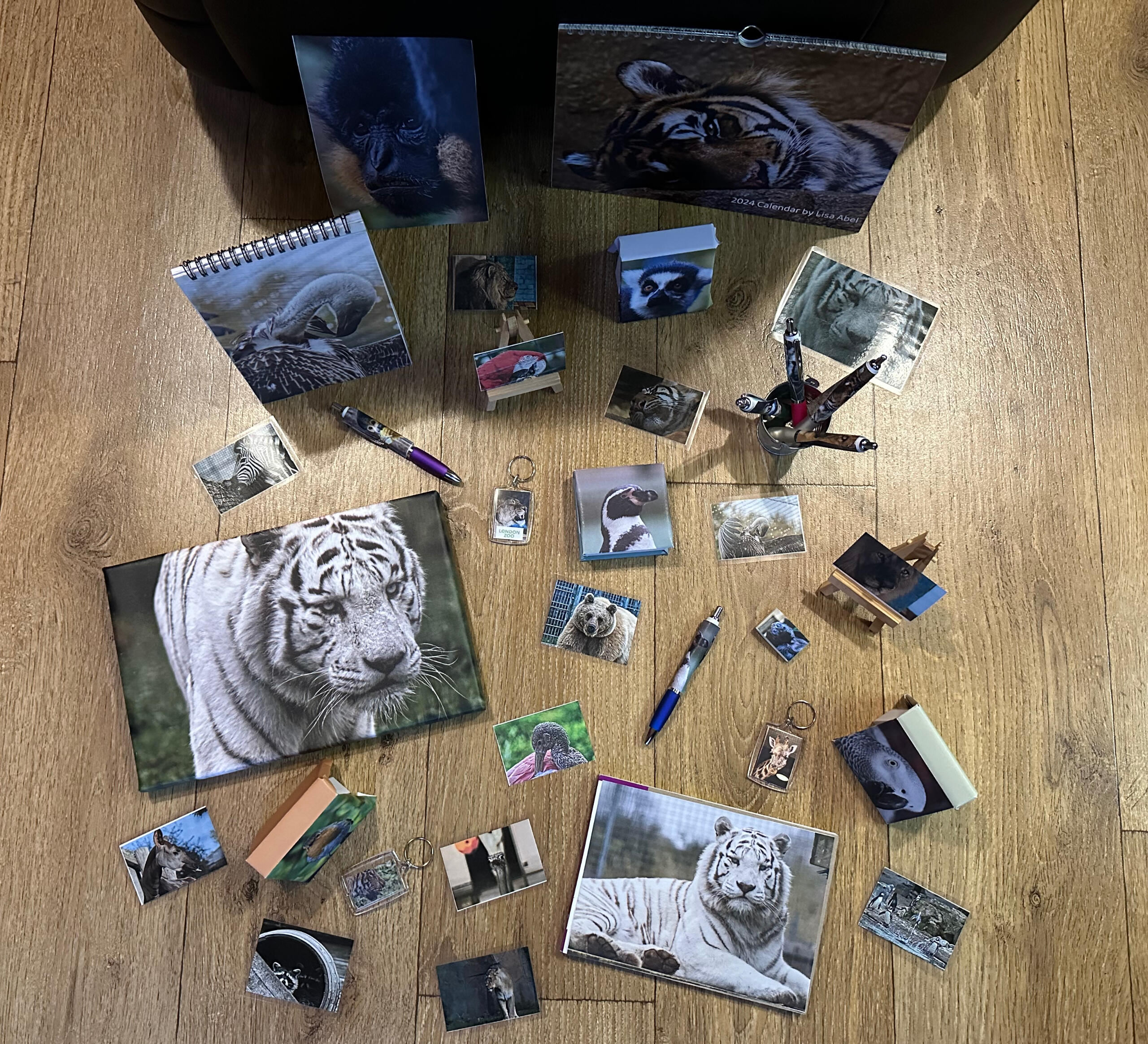
Sample Commercial Products


Photography Book
I created and ordered a book from My Picture as I wanted to see my best images collectively, and as a reference as a amateur photographer. The book did not arrive on time. Here are separate images of the pages within the book. In my previous photography project a couple of years ago I created a book to showcase my best images which worked really well. This was rectangular with a gloss front and photographic pages.Whilst I was looking through other books during research, I really liked some images (depending on what they were) as a full bleed. I desperately wanted to include this within my book. I tried out the full bleed on both sides of the page but I thought this clashed too much so I decided to add a border on the left hand side which I wasn’t against. I liked how these looked together which was the template I worked with. I then screenshotted all of the edited images from both zoos and marked which ones I liked the most to help break down the edited images like a digital contact sheet. From this I then grouped pairs of images together. I considered grouping types of animals together but I didn't want half of the book to be stronger than the rest I wanted it to be as even as possible.The 20x20cm hardcover book has a matte finish with real matte photo paper consisting of 34 pages altogether. The pages are folded out flat so that double page images would work really well. I felt that the book didn't need any context as the images speak for themselves. I want to put across that you scan view my images to see each animals personality.If I had more time, I would create more photo books; one for each zoo. I would also love to create multiple books for different audiences such as a children’s book with fun animal facts. I would experiment by adding multiple images on a page, I didn’t include this this time as I didn’t want to loose the flow of the book and wanted to keep the consistency.*click on image and move across like pages.


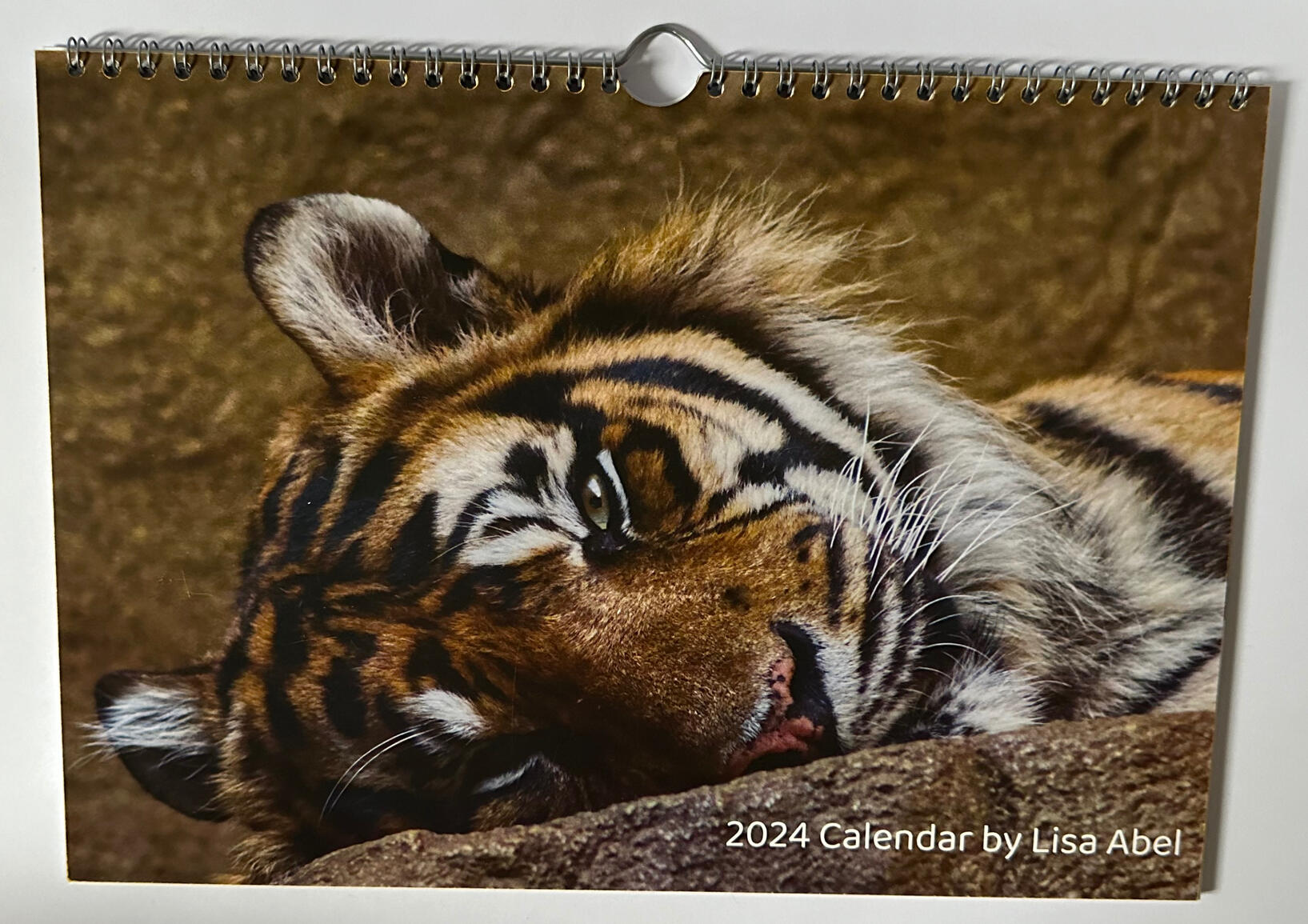
Calendar
I wanted to capture all audiences who would walk into a zoo gift shop. I felt like adults were going to be slightly difficult to target as they wouldn’t necessarily go for typical stationary. I decided to design a calendar that can be used by anyone. I got this printed from My Picture (see references) where they had a selection of different calendars to pick from. I didn’t want to go for something I didn’t like which is why I chose a rectangle format as this also suited my type of images the best.I showed some individuals whilst designing the pages and they gave me their opinions which I appreciated from a different point of view. They suggested to take some out as it didn’t fit the page too well and looked too dark and gave me a perspective that I didn’t consider when first designing it.I liked how this turned out and it was good to see it professionally done onto proper photo paper. The different advice from individuals from another point of view helped me to shape the calendar better.- I even ordered several copies for gifts!To improve I felt like some images could have been re-edited to fit the style of the calendar such as shadows and, cropping and clarity. I didn’t like the dates at the bottom as I thought that they were impractical to write on, but I only chose this to suit the images best. I could have tried the longer rectangle calendar instead despite not liking the style of it.I didn’t have much time to keep editing it and going back to it since I went to Hamerton as a risk of not arriving in time.


Notebooks
Following on from looking at sizing and cropping, I thought a good place to start would be notebooks. To keep my costs down I brought some notebooks and customised on top of them to give me more creative freedom. I brought a few different sizes and designs so that I could try out multiple way of adding the image.
Obviously if this was to be a real product then I would get them professionally printed.Overall, I thought that this was a good way to get creative and to see how proper books would get printed. The outcome helped to visualise what it would really look like which is what I wanted to put across.On the other hand, I felt like I could have played around with these a lot more by adding text or multiple images onto the page. I initially wanted to decorate the inside by creating a flip book of an animal walking and to decorate the inside cover. If I was to carry this on, this would be something I would take more time with and create many more designs to choose from. If this was going to a specific location in a professional world there would be branding on the book to advertise the place more.I wanted to create some illustrations to add to the notebooks. I would do this by using an image and turning that into an illustration for the cover and then creating line art of the outside of the animal for the inside cover. The darkroom object image that I created inspired this idea.
Pens
I decided to design some custom pens as part of my gift shop. Smaller items like this are popular to see in gift shops like London Zoo. They were fairly easy to make as I had some spare pens of the same style and just measured the size so I could ensure the printouts were roughly the same size.As I was doing pens, I thought I’d try out a rubber as these are another common item in gift shop stationery. I had some small images printed out that I stuck onto the rubber alongside other mini images that could go onto a rubber.
I only concentrated on using my images for products like the rubber. If I had more time I would look into illustrating images that could potentially be used on things like rubbers so that it’s not just photography based.I think that’s these successfully gives off the effect that I wanted the pens to look like. The thickness of the chosen pen helped to see the image better. The clip on the side makes the product look legit for this project.I could have taken more time putting it together as it as an unusual shape to shape the paper around. I also should have looked into designing pencils as another product. I didn’t do this as I didn’t want to use my time up as it will give a similar effect as the pens.


Keyrings
I printed out mini images to see how they would look like as key rings. I saw some in both gift shops that looked similar to this. Seeing the images inside the product makes it feel real and almost official. If I was to carry this on further I would potentially add branding and consider different shapes and sizes.I took the London Zoo logo and added it onto the key ring to see how it would look as an ‘official’ piece of merchandise. I have only done it with this item to see how it would look to get a rough idea.
If I was to do this professionally, I would ensure that I have the right SVG for the logo and read thoroughly through the brand guidelines.This has potential to branch into badges, stickers, and coasters using a similar concept to how I designed these.
Magnets
After creating the key rings it inspired me to create magnets, as well as seeing some displayed at Hamerton Zoo. As I did not have magnet blanks, I thought of laminating them to give the effect that they look like a magnet. This helped me to visualise what the magnets would look like if they were displayed. I tried some different sizes to see how they would look on a fridge.After having them laminated it made me realise what the images would look like if I chose for any product to have a gloss finish such as the book. I was unsure at first how it would change the look of the images. This was useful to see how they would look at low cost.
I think that some images work well with the shine upon them to make them stand out. I would like to see them bigger as the scale of the image would have a different effect with the shine of the image.I think the overall magnet effect works well by being laminated. It gives a true sense of what it would look like as a magnet which works well.I should design them at different shapes sizes to see how they would look and to make them unique as part of experimentation.


Wall Art
After viewing my images I thought that they would look amazing as prints. I had already tried them at smaller sizes, so I decided to find ways to make them bigger to see the outcome as some images view better at different sizes.
I managed to get some professionally printed onto card stock at A4 and A3 sizes. I adored how they looked and desperately wanted to see them even bigger!
I used a projector to enlarge the images to A2 and A1 without the cost to see what it would look like. Despite the projector not bringing out the clearest images I thought that most of them turned out really well and would work perfectly as a large print to be hung up somewhere. This could be in a house, gallery space, or at a zoo.I would most definitely look into these images at different sizes to be displayed in the future for individuals to purchase.Once again, I used My Picture purchase a canvas of one of my favourite images. It was good to see the quality on this material as I have only looked at paper and card samples. I decided to use stretched edges on this piece as it fitted the image better than mirrored.
Postcards
After printing some of the edited images I realised that they would make perfect postcards. Due to the amount of time I had I kept them how they are, also because there are no other distractions within the image.
They would make great souvenirs for friends and family, and perfect for parents and adults that might not want the other souvenirs.If these were to be part of one of the zoos gift shop I would consider putting branding to advertise themselves.


Here are a handful of souvenirs that I could create and get her within the time frame. I wanted to include what you would typically see in a gift shop such as notebooks but to also branch out a bit further and include calendars and prints.I love the collection that is brought together here, I can definitely see them being inside of a real gift shop. The images alone I think stand out which is why they work with the products. Some products can be mixed and matched together, I decided to take images of them collectively to see the variety and capture the attention of my audience. If I had more products with a type of animal then I would want to group them together and create a setting.I would have loved to carry on creating many more products such as clothing, drinks bottles to utilise the images and to experiment with what works with what product the best. There is so much opportunity here that it was difficult to stick to a set amount. If I spent more time focusing on particular items I could have potentially developed them further, but I wanted to see how the images are seen across different products to then go into afterwards.
I feel that I had some software limitations like not being able to access them easily and knowledge. If I had these then I would have looked more into branding and applied knowledge that I gained in previous modules. However, If I do contact these places to work on a collaboration then I will look much more in depth on brand guidelines and learn how they get their products behind the scenes.
If I used a professional studio to prepare for publicly publishing I would create outdoor settings to create more of an atmosphere like the animals are in, such as by adding leaves.
This could then develop to creating video content which can be shown at locations as a moving image advertisement for the products to catch the audience’s attention.I have enjoyed being free to make what I want to make which has encouraged my creative flow throughout my work. I hope that others enjoy viewing my work as much as I enjoyed taking them.
Pricing
Pricing is very important when it comes to a form of artwork. You need to ensure that work is not over or underpriced so that it works out for the buyer and creator. The type of product and location helps to determine the price of the product. In this case gift shops usually have higher prices than an average shop, so I will take this into account when thinking about the prices for my products.Pricing depends on the materials used and the time to create the product. Images look better on higher a quality surface also meaning that it would cost more.
I would have liked to see any of my images on different materials such as wood, glass, acrylic, and many more to see the effects it gives to the image. It would be good to see how it changed the mood of the overall image.A general rule for pricing products is to add up the materials and double that price, and then add in the labour costs which will vary depending on the level you feel your work to be.As I have two locations with sets of images, I will be combining some of them together.
If I had some more time I would create location specific products with their logos. This would also affect the price, but in this case would be a more general price.If I was to publish these as real products afterwards then I would price them at the slightly lower end of the scale to start with to gain an audience and build up a following. I don't want to scare away people from the price being too high when it’s about the images captured through the lens. As throughout the project I have considered what I would like to see as an image or product I want to apply the same concept to pricing these products too by thinking about how much I would buy it for.I have roughly priced these in the middle of a general product and an official gift shop product to get a fair view of how much they could be worth. Prices will vary depending on the materials such as a hardback or soft back for a book, or to the quality of a pen.

2024 Calendar - £30

Key ring - £2.50

Mini Square Notebook - £4.50

Pen - £3.00

Canvas 30x20cm, Stretched boarders - £40

Notebook - £6.50

Magnet - £3.50

1 A3 Card stock Print - £30

A1 Print - £100

Postcard - £2.50


Sizing
I printed out some images at different sizes to see how they would look. This helped me to determine the size of products and to see how images react to size. If there is a lot going on in the image then this wouldn’t suit being a small product.
I also tried out scaling the images up as an idea to sell as prints to suit a different target audience. Instead of printing an image A2 or A1, I decided to use a projector to see them at a larger scale to see roughly what the print would look like. I liked this way of experimentation as I grew to like my images and thought that they would look nice as a print on their own.


Behind the Scenes

Laminating ‘magnets’

Initial print outs

Professional print-outs

Contact Sheets

Net of Mini Notebook

Decisions for book pages

Pen Nets

Pre-cut ‘magnets’

Mini Studio

Print outs to show peers for feedback

Deciding Best Images

Paper texture Sample Pack

Postcards

Mini Notebook Nets


